CONSORT flow diagram
A CONSORT flow diagram shows how participants moved through a randomised controlled trial. It has four stages, named as in the CONSORT 2025 template: Enrolment (assessed for eligibility, excluded with reasons, randomised), Allocation (allocated to each arm, and whether they received the intervention), Follow-Up (lost to follow-up for the primary outcome, discontinued intervention) and Analysis (analysed for the primary outcome, excluded from analysis). This example has two arms, an intervention and a comparator.
Trial teams draw this for the results paper, because the CONSORT statement asks reports of randomised trials to include it and journals that endorse CONSORT expect it. Each box carries a count and every loss carries a reason, so a reader can check that the numbers add up from stage to stage. The diagram makes it visible how many people randomised were not analysed, which matters when judging whether the results could be biased.
Mermaid source
---
title: CONSORT flow diagram
---
flowchart LR
  subgraph enrolment [Enrolment]
    assessed[Assessed for eligibility]
    excluded[Excluded: not meeting inclusion criteria, declined to participate, other reasons]
    randomised[Randomised]
  end
  assessed --> excluded
  assessed --> randomised
  subgraph allocation [Allocation]
    allocA[Allocated to intervention: received, or did not receive with reasons]
    allocB[Allocated to comparator: received, or did not receive with reasons]
  end
  randomised --> allocA
  randomised --> allocB
  subgraph followup [Follow-Up]
    lostA[Lost to follow-up for primary outcome; discontinued intervention]
    lostB[Lost to follow-up for primary outcome; discontinued intervention]
  end
  allocA --> lostA
  allocB --> lostB
  subgraph analysis [Analysis]
    analysedA[Analysed for primary outcome; excluded from analysis with reasons]
    analysedB[Analysed for primary outcome; excluded from analysis with reasons]
  end
  lostA --> analysedA
  lostB --> analysedB
Stock Mermaid vs Line9 on this CONSORT flow diagram
Run the same source through the stock Mermaid engine and it often will not look as good. In some cases, Mermaid is able to deliver a usable graph, but not always. On this one:
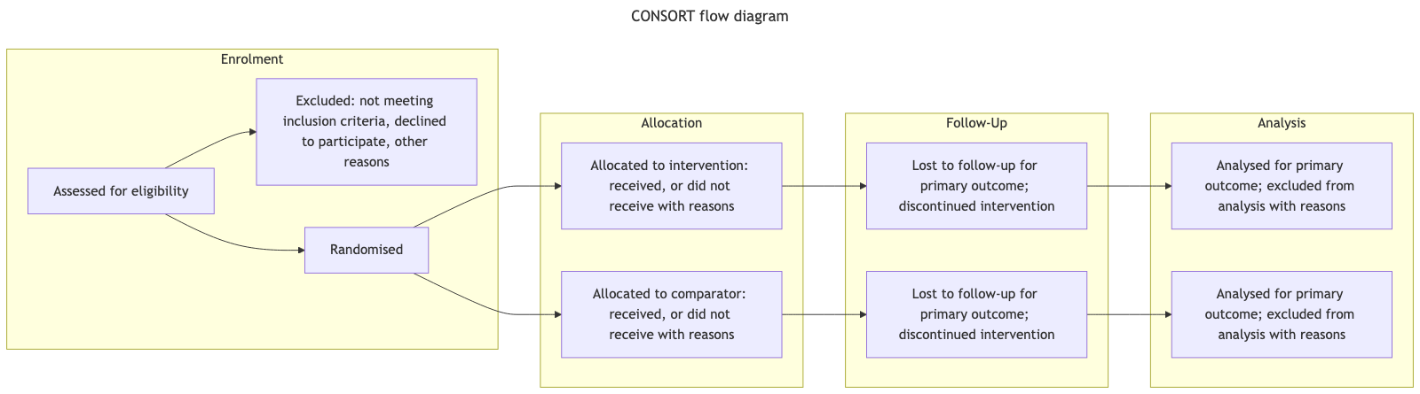
Stock Mermaid gives this diagram a similar layout to Line9, with the four stages as groups from left to right and the two arms side by side. In both, the two arms stay level with each other, so they can be compared stage by stage, and both versions are readable at a normal size.
For a fuller product comparison — layout, export, CLI, and pricing — see Line9 vs mermaid.live.
Render your own
Paste any Mermaid flowchart into the free online editor — no account needed. Prefer the terminal? Install the line9 CLI (free for personal use).
Related diagrams
- User authentication flow (with MFA)
- GitHub pull request workflow
- CI/CD pipeline (with rollback)
- AI coding agent workflow
- Incident response runbook
- Database migration rollout
- Feature-flag canary rollout
- Webhook delivery, retry, and dead-letter flow
- Decision tree
- Payment flow
- Content approval workflow (with legal review)
- Support ticket lifecycle
- Peer-review process
- Procure-to-pay process
- Recruitment process
- Kubernetes cluster architecture
- E-commerce order processing
- RAG application architecture
- Data flow diagram
- Network topology diagram
- System context diagram
- Event-driven architecture
- User flow diagram
- HACCP flow diagram
More scenarios on the Mermaid examples hub.